ChatGPT Ads: The Ad Image Design Rules You Need to Know
The Rise of Conversational Ads
AI assistants like ChatGPT are introducing a new type of advertising environment: conversational placements.
Unlike traditional display ads or social media banners, ads inside AI chat interfaces are minimal, contextual, and integrated directly into the conversation flow.
Users inside a chat interface are typically in problem-solving mode, not passive browsing mode. They are looking for answers, tools, and solutions.
Because of this, conversational ads rely on what can be called micro-visuals: extremely compact visual signals designed to communicate meaning instantly inside text-heavy environments.
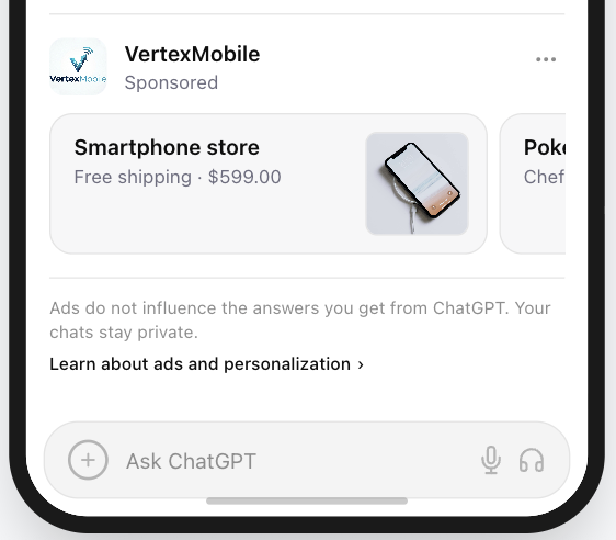
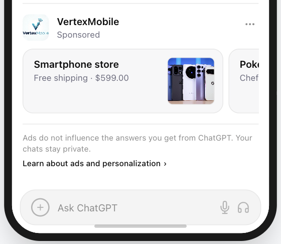
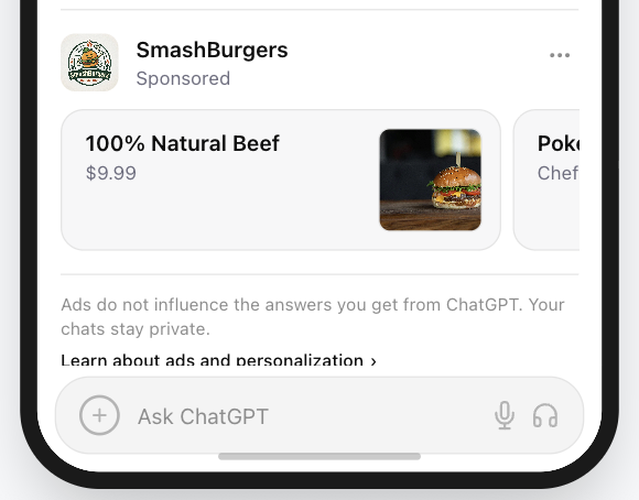
A typical ChatGPT ad placement contains only three visual elements:
- Ad Image (1:1 micro creative)
- Headline (short value signal)
- Sponsored label
In this environment, the ad image becomes the visual anchor of the entire ad.
Core Principle
Golden Rule: Your ad image should not look like an advertisement.
It should look like a useful tool or recommendation.
How we built this guide
This article combines PAICAds creative reviews across our Ad Preview Tool, interface pattern analysis for conversational placements, and established UI guidance on icon clarity, contrast, and masked safe zones.
If you need help applying these ideas to a live campaign, see our ChatGPT Ads launch support page or review our strategy article on what actually changes when ChatGPT Ads go live.
If the ad image is cluttered, blurry, or visually noisy, the brain categorizes it as advertising clutter and skips it. When the micro creative is well chosen, it feels like a natural continuation of the ChatGPT response.
Designing effective ChatGPT ads therefore requires a new creative skill - micro creative design.
On this page
The Shift From Display Ads to Conversational Ads
Designing ad images for ChatGPT ads requires a completely different mindset than designing traditional banner ads.
| Design Factor | Traditional Display Ads | ChatGPT / Conversational Ads |
|---|---|---|
| Primary Goal | Emotional storytelling | Instant recognition |
| Visual Style | Photography, illustrations | Minimal micro creatives / simple brand marks |
| Scale | Large formats | Small on-screen footprint; square ad image asset |
| User State | Passive browsing | Active problem-solving |
| Visual Priority | Image + copy | Ad image + headline |
Traditional advertising tries to capture attention.
Conversational ads must signal usefulness instantly.
In AI chat interfaces, clarity beats creativity.
This same shift is why we recommend evaluating ad creatives in the context of the interface itself rather than as standalone mockups. A square asset that looks polished in Figma can still fail once it sits next to a short headline, a sponsored label, and a dense answer block.
7 Design Principles for Effective Conversational Micro-Visuals
1. Hyper-Minimal Composition (The Signal Rule)
In conversational ads, the ad image acts as a micro creative, not a visual story.
At micro sizes (64-120 px), complex visuals turn into visual noise. Ad images that contain too many details become unreadable at micro sizes and are ignored.
Effective micro creative design usually includes:
- A single recognizable object
- Bold shapes
- High contrast
- Simple geometry
When in doubt, remove elements until only the core symbol remains.
Google’s Material Icons guidance describes effective UI icons as simple, minimal forms optimized for readability and clarity at both large and small sizes. That principle maps well to conversational ad images, where the visible area is even tighter than a typical app icon.
2. Design for Light Mode and Dark Mode
ChatGPT and most AI chat interfaces support both Light Mode and Dark Mode.
Ad images that rely on transparent backgrounds or low-contrast colors may disappear depending on the theme.
Example problem:
- White ad image on transparent background -> invisible in Light Mode
- Black ad image on transparent background -> invisible in Dark Mode
Best practice:
Use a solid background container color behind your ad image.
For example:
- A dark or saturated background color (such as brand blue)
- A dark neutral container
- A high-contrast color block
This ensures the ad image remains visible regardless of interface theme.
That guidance also lines up with Google’s recommendations for icon treatments on light and dark surfaces, where foreground/background separation is what preserves readability across themes.
* The goal is one asset treatment that stays clear in both Light Mode and Dark Mode, not separate fixes for each theme.
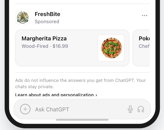
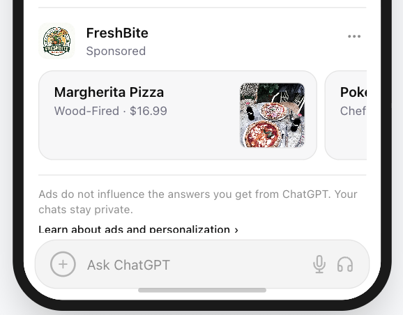
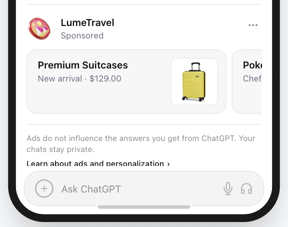
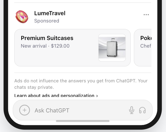
3. Pass the Silhouette Test
A strong micro creative remains recognizable even without internal details.
At very small sizes, users often perceive only the overall shape of an ad image rather than its fine details. Because of this, a distinctive silhouette is one of the most reliable ways to preserve recognizability.
How to test it:
- Convert your ad image into a solid black shape and remove all internal details.
- Ask yourself: Can the object still be recognized from the outline alone?
- If the answer is yes, the ad image will likely remain recognizable at small sizes.
Strong silhouette examples:
- magnifying glass
- calculator
- chat bubble
- shield
- lightning bolt
These shapes remain recognizable even without internal details.
Weak silhouette examples:
- dashboard screenshots
- complex multi-element logos
- photographs
- detailed illustrations
These visuals depend on internal detail rather than overall shape, which makes them difficult to recognize at micro sizes.
In conversational interfaces, where ad images appear small and next to text, a clear silhouette significantly improves recognition speed.
4. Use Color for Recognition Signals
Color plays an important role in how users interpret ad images in conversational interfaces.
In many cases, users process color cues faster than text, which allows color to communicate meaning almost instantly.
Certain colors have widely recognized associations in digital products:
| Color | Typical Association |
|---|---|
| Blue | Trust, security, reliability |
| Green | Productivity, success |
| Orange | Alerts, urgency |
| Purple | Creativity, AI tools, innovation |
| Red | Errors, warnings |
These associations appear across many software interfaces and help users quickly interpret the purpose of a tool or feature.
Using familiar color cues can therefore improve recognition speed.
However, semantic color choices should never reduce readability or contrast.
5. Design Color for Contrast and Legibility
In conversational interfaces, ad images are displayed inside chat layouts that often use neutral backgrounds.
Common interface backgrounds include:
- white
- light gray
- beige or warm neutral tones
- dark gray or black in Dark Mode
Because of these neutral backgrounds, ad images that rely on light or pastel colors may blend into the interface and become difficult to see.
The practical accessibility benchmark here is contrast, not brand purity. The W3C’s WCAG contrast guidance explains why images of text and UI elements become harder to read when foreground and background values are too close.
Foreground vs Background
Effective ad images clearly separate two visual layers:
Foreground: The symbol or object that communicates meaning.
Background: A color container that ensures the symbol remains visible.
Example structure:
- Good contrast: white symbol, dark or saturated background
- Poor contrast: light symbol on light background, pale brand color without sufficient contrast
The Beige Interface Problem
Many modern reading interfaces use soft neutral tones such as beige, sand, or cream to reduce eye strain.
While these backgrounds create a pleasant reading experience, they also make very light ad image colors harder to see.
For example:
- pale yellow symbol on beige background
- cream-colored ad image on light interface
Both combinations produce very low visual contrast.
To avoid this issue:
- use darker or saturated background containers
- ensure strong separation between symbol and background
- avoid relying solely on very light colors
In micro-visual environments, contrast matters more than strict brand color consistency.
If a brand color is too light, placing the symbol inside a darker container can significantly improve readability.
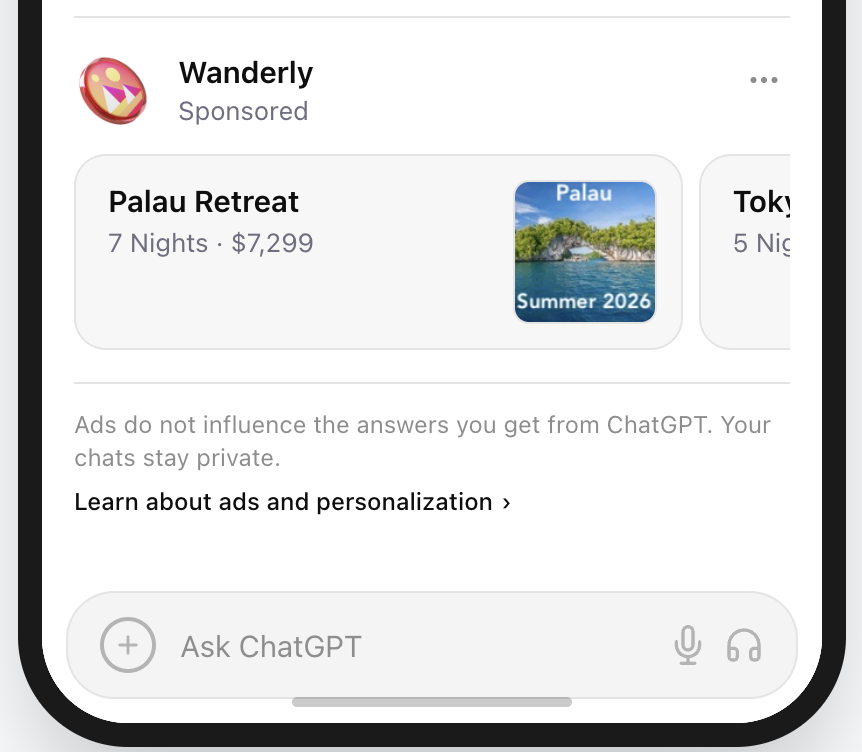
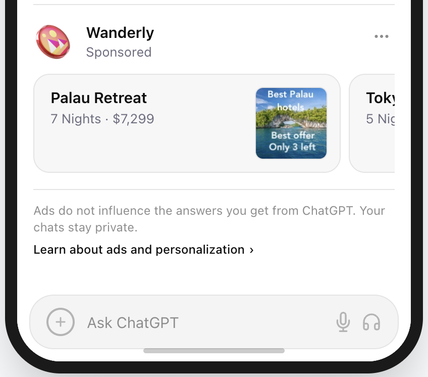
6. Consider Using Text Inside the Ad Image
Text inside an ad image is optional, not required. In some cases, however, a very short line of text can improve recognition and even perform better than relying only on the headline on the left.
Used carefully, text inside the ad image can reinforce the offer, clarify the category, or add a compact CTA.
At micro sizes, users do not read - they scan. Any text inside the ad image should be extremely short and instantly clear.
Effective text inside ad images should:
- Contain 1-3 words maximum
- Communicate one clear offer, action, or theme
- Support recognition rather than replace the headline
- Feel clean and useful, not noisy or overly promotional
Good uses of short text include:
- “50% off”
- “Your new look”
- “Summer 2026”
- “Try free”
Avoid:
- Long slogans or explanatory copy
- Multiple claims competing in one small space
- Temu-style promotional clutter
- Anything that takes more than a second to understand
Why it works: Short text can add another recognition signal inside the ad image and can sometimes convert better than depending on the surrounding copy alone. But once the text becomes aggressive, crowded, or low-quality, it stops helping and starts looking like ad clutter.
7. Design for the Circular Mask (The Safe Zone)
Many conversational interfaces display ad images inside circular containers, even when the uploaded asset itself is square.
This means the corners of the image may be cropped automatically.
To avoid accidental clipping, designers typically follow a safe-zone rule.
Design rule:
Keep important visual elements inside the central 80% of the canvas.
This area is often referred to as the safe zone in UI asset design.
Android’s adaptive icon guidance uses the same idea: keep the important foreground inside the protected safe zone so it remains legible when circular or squircle masks are applied.
Avoid placing critical elements near the edges or corners of the ad image.
Recommended asset structure:
- square canvas
- centered symbol
- balanced padding around the ad image
This ensures the micro creative remains readable even when displayed inside circular containers.
Should You Use Your Logo as the Ad Image?
In most cases, no.
Unless your brand is instantly recognizable (such as Apple or Nike), a company logo is often too complex to remain readable when rendered at very small sizes inside the interface.
Conversational ad images typically appear very small next to the headline, so intricate logos or wordmarks can become difficult to recognize.
Logo vs Ad Image: What Is the Difference?
These two elements are not interchangeable.
A logo is a brand identifier. An ad image is a product or use-case signal.
That distinction matters in conversational advertising because users are usually scanning for a solution first and a brand second.
| Element | Purpose | Typical Design |
|---|---|---|
| Brand Logo | Identifies the company | Wordmarks, detailed marks, full brand identity |
| Ad Image | Signals the product’s function instantly | Simple symbol or product cue |
A logo answers: “Who made this?”
An ad image answers: “What does this help me do?”
If a user can understand the company but not the offer, the logo is doing its job but the ad image is not. If a user can immediately understand the offer, the ad image is doing the right work.
Because conversational ads appear during active problem-solving, users scan for solutions, not brand identity.
Why Product Ad Images Often Perform Better
When rendered small, logos with multiple elements, text, or fine details lose clarity.
Function-based ad images communicate meaning much faster.
Example:
User query: “How do I calculate my taxes?”
| Ad Image | User Interpretation |
|---|---|
| Company logo | Unknown brand |
| Calculator ad image | Tool for solving my problem |
In this context, a calculator ad image signals the solution immediately, while a generic brand logo requires more cognitive effort.
When a Logo Does Work
Using a logo can work when:
- The logo is extremely simple
- The brand symbol is already iconic
- The logo functions visually like a compact app-style badge
Examples of logos that scale well:
- Apple
- Nike
- Spotify
- Slack
These marks remain recognizable even at very small UI sizes.
For most brands, though, the better path is a product cue first and branding second. If you are deciding between the two, preview both approaches in the interface before launch rather than judging them in isolation. Our free preview tool is built for exactly that comparison.
ChatGPT Ad Image Design Checklist
Before launching a conversational ad campaign, review your ad image against the following checklist.
Clarity
- The ad image represents one clear object or symbol
- The silhouette remains recognizable even without internal details
- The ad image passes the small-size recognition test
Simplicity
- The design avoids unnecessary detail
- The ad image is built from bold, simple shapes
Contrast
- The foreground symbol clearly contrasts with the background
- The ad image remains visible in both Light Mode and Dark Mode
- The design does not rely on very light or pastel colors alone
Layout
- The ad image is centered on a square canvas (1:1)
- Important elements remain inside the safe zone (central ~80%)
- The ad image remains readable when displayed inside circular containers
Function
- The ad image communicates what the tool does, not just the brand
- The symbol would still make sense without reading the headline
Very short text inside the ad image, used carefully, may improve recognition and can sometimes lead to higher conversion.
If most items are checked, the ad image is likely well suited for conversational ad placements.
The PAICAds Ad Preview Tool
The PAICAds Ad Preview Tool lets you instantly visualize how your ad creatives will appear across different platforms. Simply enter your content to generate ready-to-use ad variations and see them in realistic formats. It helps you refine messaging, adjust visuals, and iterate quickly before launching your campaigns.
If you want a second pair of eyes on creative direction, audience fit, or launch planning, our team also offers ChatGPT Ads launch support.
Sources and Further Reading
About the author
Darya
Creative Strategy Lead at PAICAds
Darya leads creative strategy at PAICAds, focusing on how ad visuals, prompts, and landing-page context perform inside conversational interfaces like ChatGPT.
Next step
Want help turning these ideas into live ChatGPT ads?
Use the PAICAds preview tool to test creatives, then review our launch support options if you need help with strategy, creative review, or early campaign optimization.
Keep reading
Related PAICAds guides
March 1, 2026
Why Your AI Optimization Playbook Will Fail on ChatGPT Ads
ChatGPT Ads just launched, and every vendor is promising AI-powered optimization. Here's why that's premature — and what actually works right now.
February 8, 2026
Anthropic Super Bowl Ads vs ChatGPT: What Advertisers Should Know
Anthropic mocked ChatGPT ads during the Super Bowl. Here's what Sam Altman's response means for advertisers evaluating the channel.
February 3, 2026
OpenAI ChatGPT Ads: A Measured Perspective for Advertisers
What advertisers actually know about OpenAI's ChatGPT ads, what remains uncertain, and how to plan without overreacting.